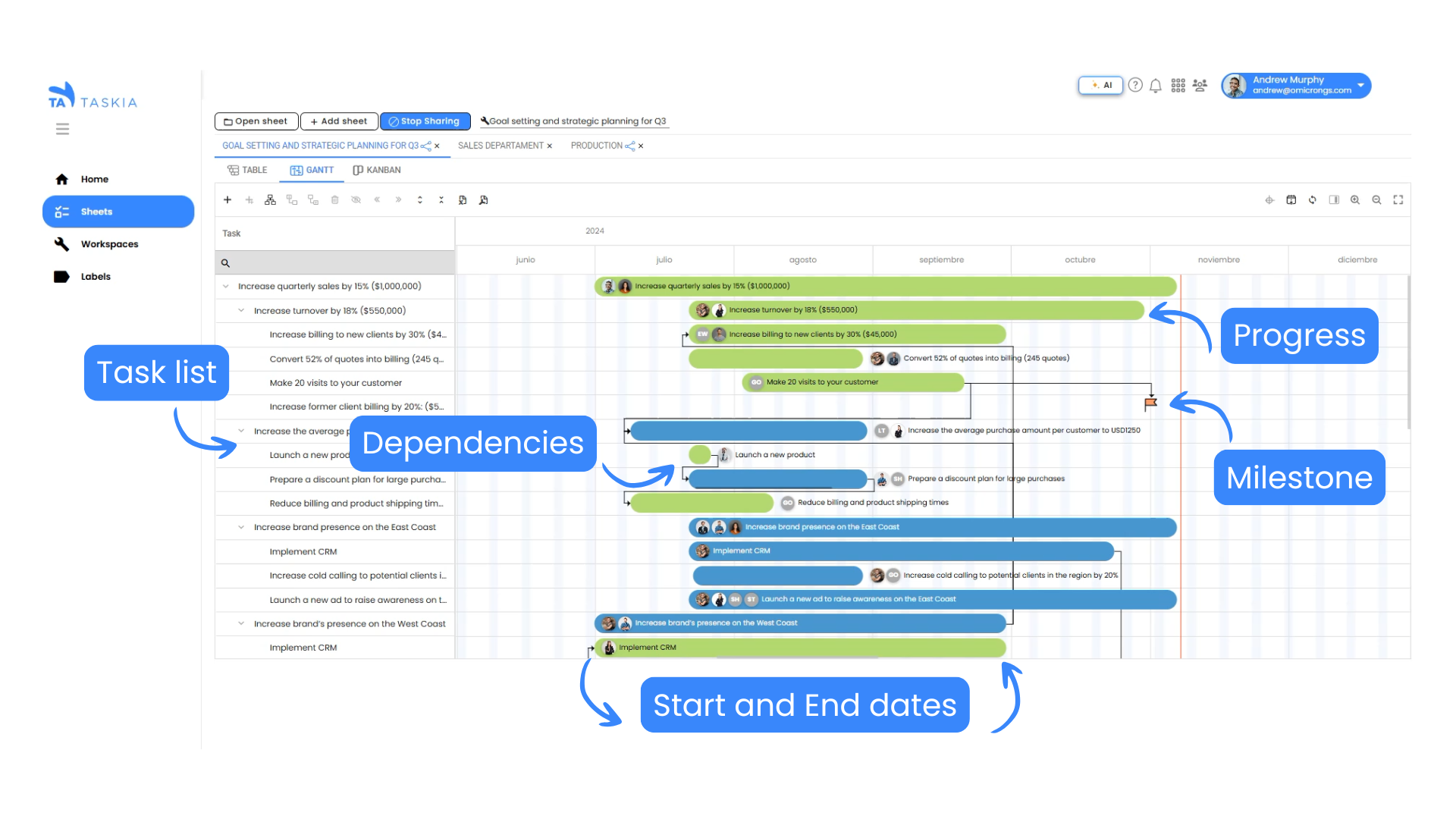
The Gantt chart, named after its creator Henry Gantt, is a powerful visual tool used in project management to plan, track, and manage tasks. It provides a clear overview of project timelines, dependencies, and progress, making it a valuable asset for teams of all sizes.
To effectively use a Gantt chart, it’s crucial to understand its essential components.
Here’s a breakdown:

1. The Task List: The Foundation of Your Project
- Tasks: The core of any Gantt chart is the list of tasks that need to be completed for the project. These tasks are typically listed vertically on the left side of the chart.
- Task Breakdown: For clarity and efficient task management, break down large tasks into smaller, more manageable sub-tasks. This makes it easier to track progress, identify potential bottlenecks, and allocate resources effectively.
- Task Hierarchy: Use indentation or numbering to create a hierarchy of tasks, showing the relationships between parent tasks and their sub-tasks. This helps visualize the overall project structure and promotes a clear understanding of the workflow.
2. The Timeline: Visualizing Your Project’s Journey
- Time Units: The horizontal axis represents the project timeline, divided into time units such as days, weeks, months, or quarters. Choose time units that are appropriate for the project duration and complexity.
- Time Scale: The timeline should be scaled to accurately represent the project duration. Ensure that the time scale is clear and easy to read, allowing for a quick understanding of the project’s timeline.
3. Task Bars: Visualizing Task Duration and Progress
- Duration: Each task is represented by a bar that extends horizontally across the timeline, indicating the task’s duration. The length of the bar visually represents the time required to complete the task.
- Start and End Dates: The left edge of the bar represents the task’s start date, while the right edge represents the task’s end date. This provides a clear visual indication of the task’s timeframe.
- Color Coding: Use different colors to differentiate between different task types, teams, or priorities. This enhances visual clarity and makes the chart easier to understand, especially for complex projects with multiple teams or task types.
4. Dependencies: Understanding Task Relationships
- Task Relationships: Dependencies show the relationships between tasks. An arrow or line connecting two tasks indicates that one task must be completed before the other can begin. These dependencies are crucial for ensuring a logical workflow and preventing delays.
Types of Dependencies: Common dependency types include:
- Finish-to-Start: The second task cannot start until the first task is finished.
- Start-to-Start: The second task cannot start until the first task starts.
- Finish-to-Finish: The second task cannot finish until the first task finishes.
- Start-to-Finish: The second task cannot finish until the first task starts.
5. Milestones: Marking Key Achievements
- Significant Events: Milestones represent significant events or deadlines within the project. They are typically marked with diamonds or other markers on the timeline. Milestones help track project progress and identify key deliverables.
- Project Progress: Milestones are crucial for maintaining momentum and ensuring that the project stays on track. They provide clear checkpoints for measuring progress and celebrating achievements.
6. Additional Elements: Adding Context and Detail
- Task Notes: Add notes to individual tasks to provide additional context, such as specific instructions, resource requirements, or potential risks. These notes can be helpful for clarifying tasks and ensuring everyone is on the same page.
- Resource Allocation: Use symbols or colors to indicate the resources assigned to each task, such as personnel, equipment, or materials. This helps visualize resource utilization and identify potential bottlenecks.
- Progress Indicators: Use shading or progress bars to visually represent the completion status of each task. This provides a clear visual indication of the project’s overall progress.
Understanding the components of a Gantt chart is essential for effectively using this powerful project management tool. By mastering these elements, you can create clear, informative, and visually appealing Gantt charts that help you plan, track, and manage your projects with confidence. Whether you’re using agile, scrum, kanban, or waterfall methodologies, the Gantt chart can be a valuable tool for improving team collaboration, time management, and overall productivity.

